Analysis: the periodic patterns of the network frequency
Introduction
At any point in time, the consumption and the production of electric energy in the synchronous area has to be equal. Any mismatch between demand and supply is first balanced by the rotational energy stored in the turbines of generating power plants: if generation is smaller than consumption, the turbines decelerate, leading to a frequency decrease. Similarly, if generation is larger than consumption, the frequency increases. Therefore, imbalances leave a clear trace in the network frequency – and they occur at different magnitudes and time scales.
There are many causes for imbalances between generation and consumption. In rare cases, strong and abrupt frequency drops are caused by forced outages of generation or transmission units, see our May or our July blog posts (Frequency Drop in May 2021 , Iberian Peninsula separated from UCTE on 24/07/2021). The most obvious periodic, i.e. deterministic, patterns in the network frequency are, however, caused by the markets. Long-term, day-ahead, intraday or regulating power markets all act on different time scales, which has an influence on the frequency. For example, in most countries intraday markets provide 15-min products, which to some extent means that individual generation units are expected to adjust periodically every 15 minutes.
The hourly patterns
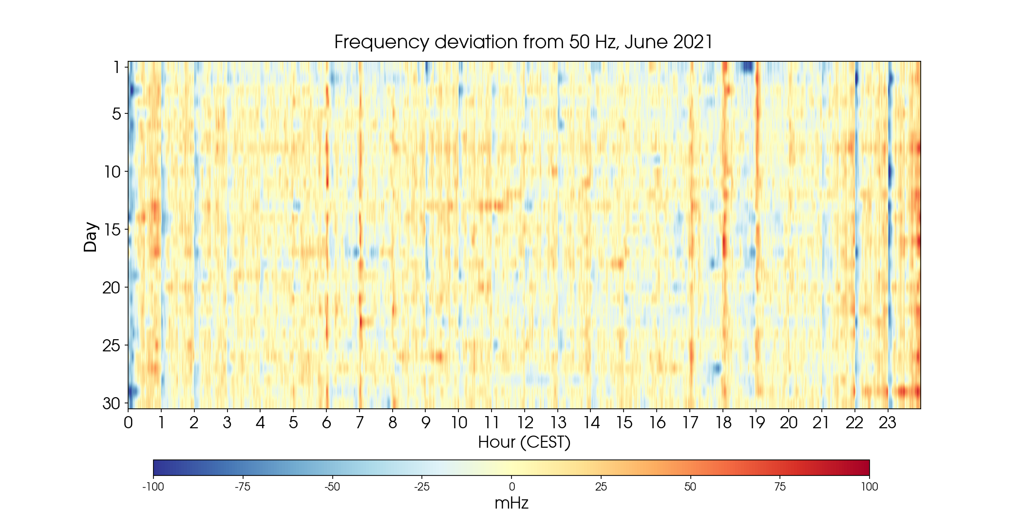
The following waterfall diagram shows minute-averages of the frequency deviation for June, where the vertical axis denotes days, and the horizontal axis the start of each hour per day. The strong vertical line structure represents daily recurring patterns in the frequency deviations at each hour break. Day-ahead market products and hour-related intraday auction products as well as half-hourly and quarter-hourly intraday auction products start or end at the hour break. Therefore, the changes around hour break can be mostly traced back to product changes. As demonstrated already in prior posts (Mains frequency dips to 49,84 Hz on 03.04.2019 at 2100 hours ), we see prominent negative deviations at 10 and 11 pm, where typically power plants are shut down after the day.
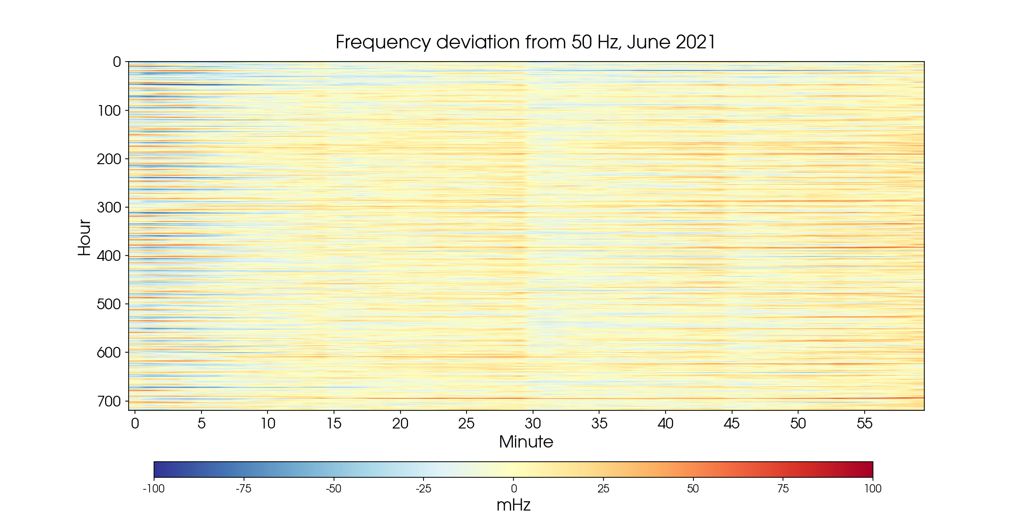
If we look closer, on the scale of minutes, we expect to see patterns of the intraday market that operates for time intervals of 15 minutes. The next figure shows again the same data, but this time with the x-axis representing the minutes of every hour in June. There are clear changes in regime every 15 minutes. What is interesting to see is that within each 15 minutes window, the color typically changes from blue to red, i.e. there is an initial undersupply, which is later made up for with an oversupply. We also see that there seems to be a stronger transition at 30 minutes. This is because in some countries (such as France, see the page of the EPEX SPOT), the intraday trade operates at 30 minutes.
How do these analyses support Gridradar’s work?
The grid frequency shows in real-time if energy production and consumption are in balance. As we showed here, the frequency is composed of several periodic signals. Gridradar employs state of the art Machine Learning models to forecast frequency and provide short-term analyses of upcoming system imbalances for different European markets. In so doing, we are able to provide information how power plants and RES producers should balance their systems to save costs.
Note
In the original version of this article the Fourier spectrum of the power frequency was shown. We incorrectly interpreted the harmonics of the hourly frequency change as a signal in the frequency. We thank the attentive readers who noticed the error in the original version.